MEDIBANK
UX DESIGN // 2023
CLIENT
Medibank is one of the largest Australian private health insurance providers. Their recent brand refresh – in 2022 – centres on the power of human potential, supplemented by a library of ‘fun biology’ and custom emojis to customise imagery.
I was a key digital and UX designer across PHI teams (Acquisition, Retention, Loyalty, Corporate, OSHC, Essentials) and Finance teams (Pet, Travel, Life, Income).

BRIEF
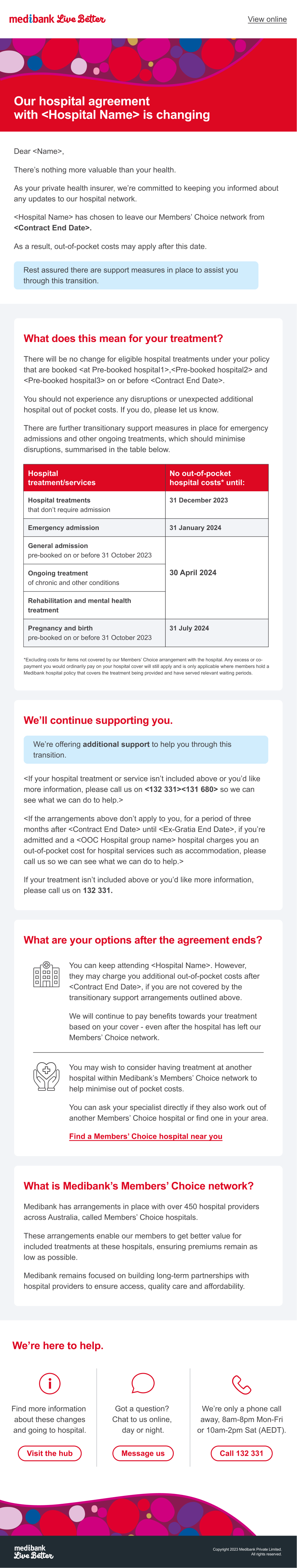
Medibank is legally obliged to inform members if their local hospital goes out of contract through eDMs, DMs and a dedicated landing page.
Medibank needed to overhaul their out of contract communications with a digital-first approach that clearly communicated the situation while mitigating potential negative sentiment.
And they needed to allow for a number of dynamic variables, like pre-booked members/catchment members or individual hospital/provider group.
SOLUTION
Create a dynamic, modular eDM template for the Essentials team at Medibank.
Through discussions with their internal development team, we shrunk down scores of potential templates to one template with variable sections they could swap in and out.
It was important that the eDM design complemented the copy hierarchy. I proposed light blue boxes to highlight the most important information per section, subconsciously calming the reader and offsetting the brand colour, red. Essential dates and numbers were bolded to assist with scannability. We placed CTA links throughout the email, to encourage members to do their own research before calling Medibank.
Best of all, we reduced the length of the previous communications by half – massively increasing the likelihood that members would read and understand the information.