M&G
UI DESIGN // 2025
CLIENT
M&G is a leading UK based savings and investments business, managing investments for both individuals and for large institutional investors, such as pension funds.
I was a key part of the tech team at M&G, working as a UI Designer.

BRIEF
M&G had recently de-merged from Prudential and so decided on a full scale rebrand, as a way to reintroduce themselves to the world and encourage younger people to become members.
With this came a complete website redesign for both the adviser and customer sites. This new site needed to look modern and inviting, whilst still remaining trustworthy and timeless.
SOLUTION
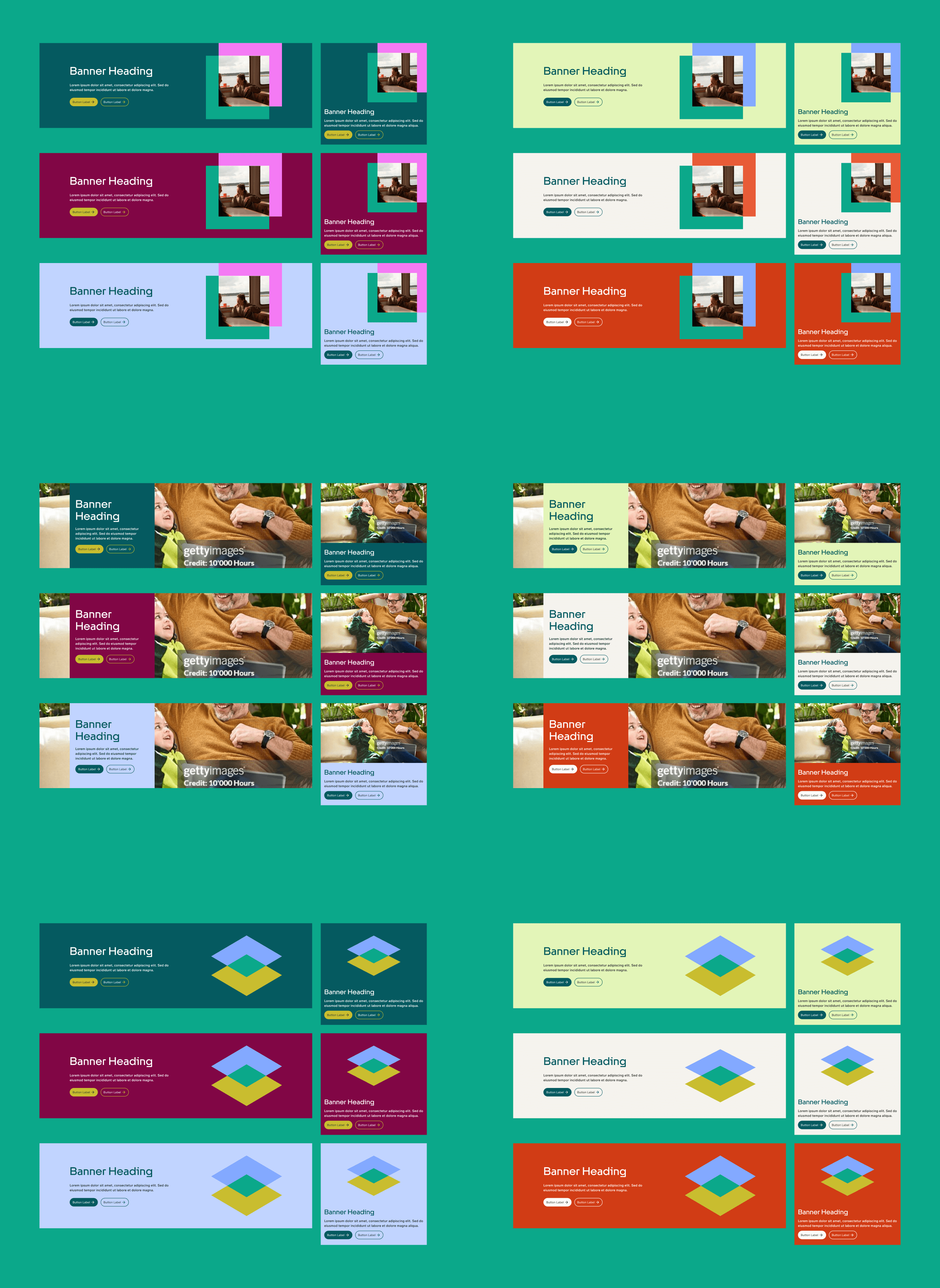
Collaborating with an agency, we first ran tests on the user journeys and the colour palette. We then worked in design sprints to rebuild the website from scratch.
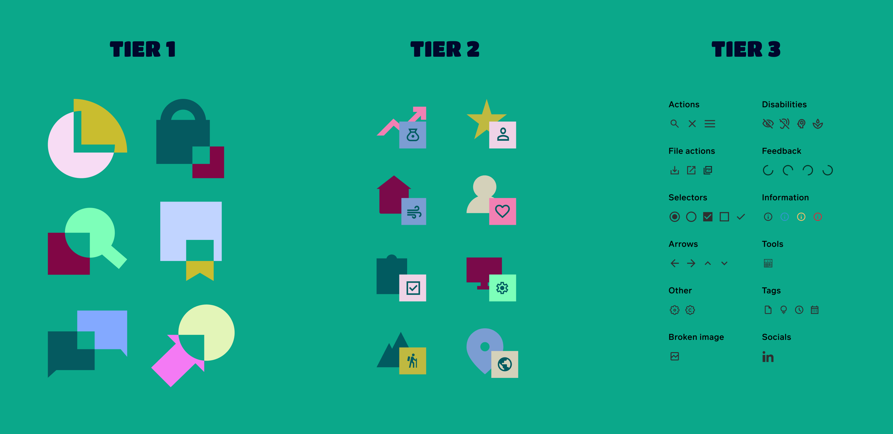
This involved building a design system from an atomic level up.
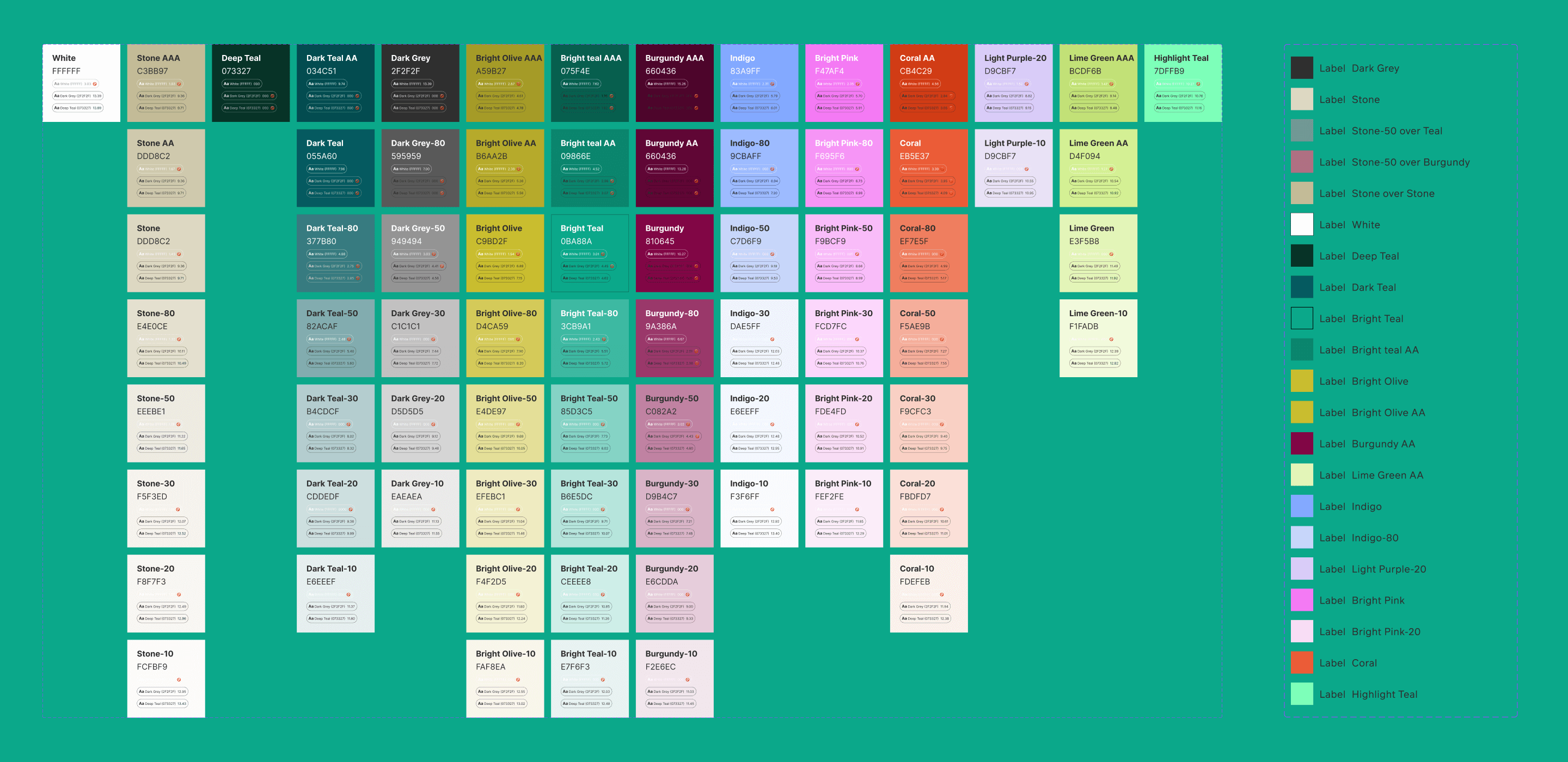
Starting with variables and tokens - such as colour and font sizes
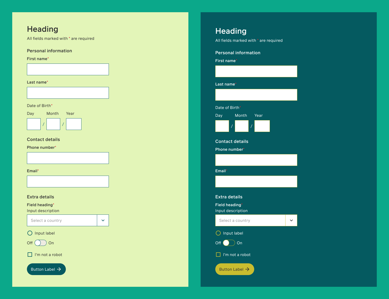
Then moving to core components - like buttons and tooltips
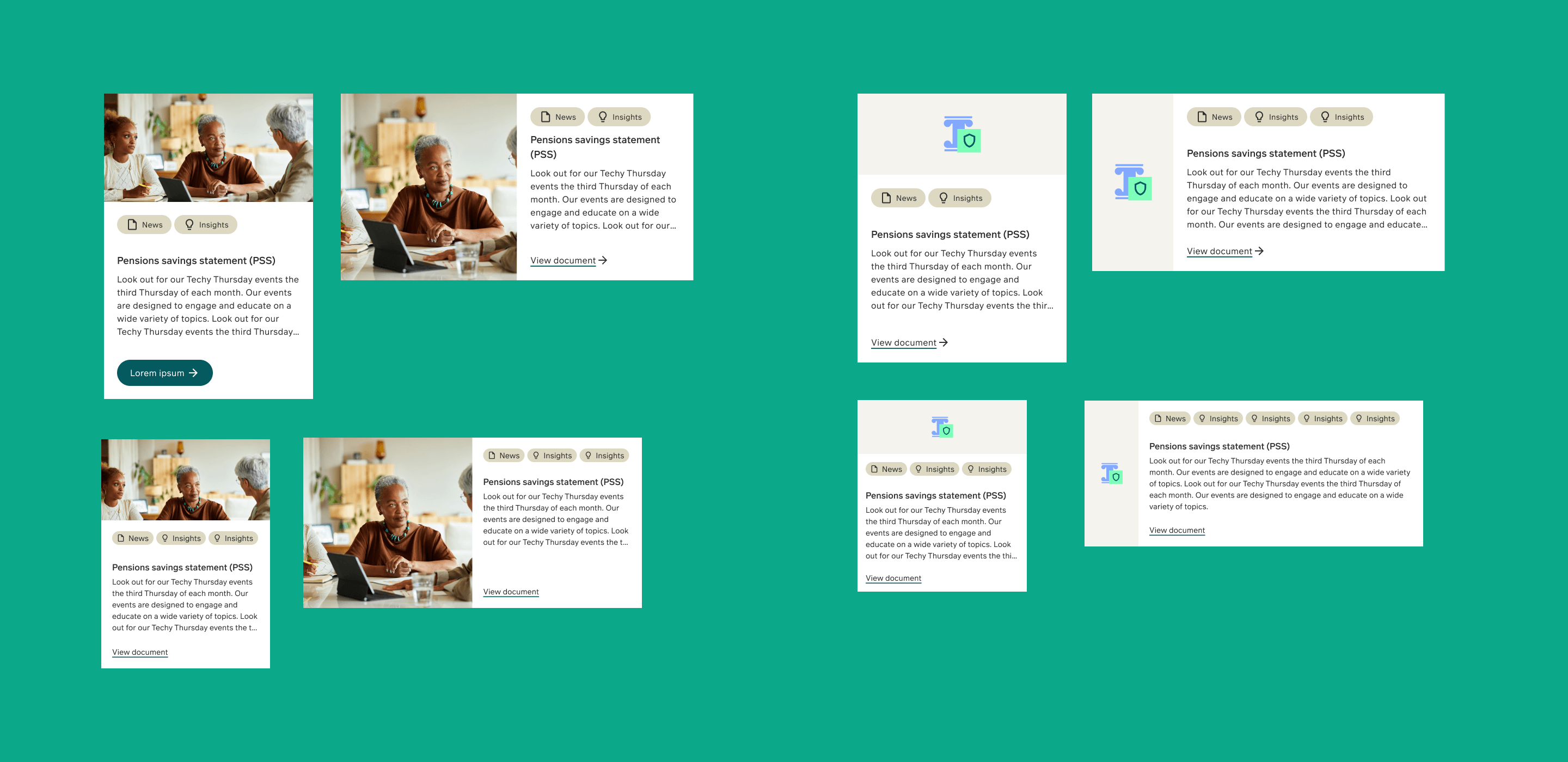
Then to larger more complicated components - such as banners, cards, tables and calculators
We would then build page templates
The website also had to be WCAG 2.2 AA compliant by law, which we prioritised at every step. This was a huge uplift, given that the site was not accessible beforehand.